It's better than anything "ops". But I like the other throwback look better.
The ops uniforms should be called the "oops" uniforms.

HOF


Posted 22 August 2017 - 10:25 AM
It's better than anything "ops". But I like the other throwback look better.
The ops uniforms should be called the "oops" uniforms.
Owner
Posted 22 August 2017 - 10:29 AM
My order:
1) Regular throwbacks.
2) Red top, white legs, MD flag helmet.
3) Black ops.
4) White top, black legs, MD flag helmet.
5) Red top, black legs, MD flag helmet.
6) White top, red legs, MD flag helmet.
7) White ops.
8) Red ops.
9) 125 year throwbacks.
HOF

Posted 01 September 2017 - 05:42 PM

Sr. Terps Analyst
Posted 08 September 2017 - 03:31 PM
HOF
Posted 08 September 2017 - 03:44 PM
They're lucky it won't be too hot. Septembers usually still hit upper 80's, lower 90's around these parts.
Sr. Terps Analyst
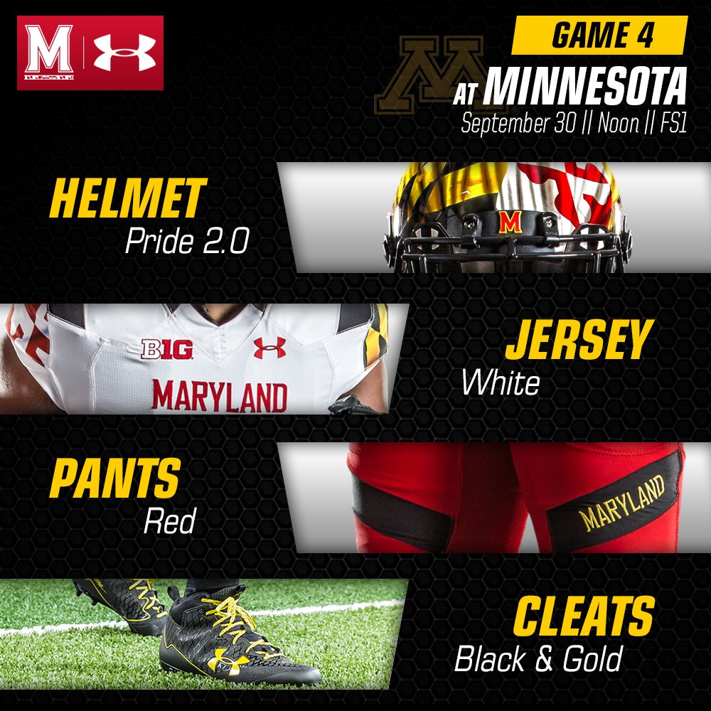
Posted 22 September 2017 - 09:54 AM
Sr. Terps Analyst
Posted 29 September 2017 - 10:31 AM
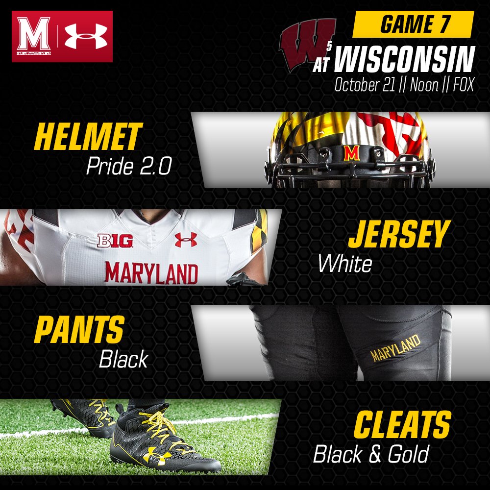
Sr. Terps Analyst
Posted 13 October 2017 - 10:29 AM
Seems like this has become the team's default home uniform for 2017. They're asking all fans to wear black.

Sr. Terps Analyst
Posted 20 October 2017 - 10:43 AM
First time this season they'll be wearing this combination.
Sr. Terps Analyst
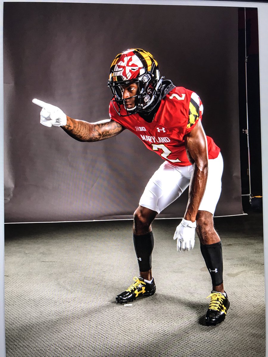
Posted 10 November 2017 - 01:59 PM
First time they'll be wearing the red jerseys this season.

Sr. Terps Analyst
Posted 20 July 2018 - 09:25 AM
Looks like the Terps have slightly updated their uniforms for this season. No more black bar accent on the shoulders and across the pants. New numbers on the shoulders. White instead of gold text on the chest.
Sr. Terps Analyst
Posted 13 August 2019 - 10:39 AM
UMTerps: Terps Unveil Throwback Uniforms to be Worn on Homecoming
https://umterps.com/...homecoming.aspx
Script is back!
HOF
Posted 13 August 2019 - 10:43 AM
UMTerps: Terps Unveil Throwback Uniforms to be Worn on Homecoming
https://umterps.com/...homecoming.aspx
Script is back!
Love it. Anything throwback MD does has looked great.
I Miss McNulty

Posted 13 August 2019 - 11:09 AM
God they're so much better than all these new Under Armour abominations -- football and basketball, but football mostly.
I get the money that the school gets from them is awesome, but they've completely ruined the brand IMO.
The new "M" logo over Testudo holding the M is absurd.
Gah, I hate Under Armour lol.
There is baseball, and occasionally there are other things of note
"Now OPS sucks. Got it."
"Making his own olive brine is peak Mackus."
"I'm too hungover to watch a loss." - McNulty
@bopper33
HOF
Posted 13 August 2019 - 11:13 AM
God they're so much better than all these new Under Armour abominations -- football and basketball, but football mostly.
I get the money that the school gets from them is awesome, but they've completely ruined the brand IMO.
The new "M" logo over Testudo holding the M is absurd.
Gah, I hate Under Armour lol.
Yeah but the students probably love all the wacky UA uniforms.
HOF
Posted 13 August 2019 - 12:15 PM
God they're so much better than all these new Under Armour abominations -- football and basketball, but football mostly.
I get the money that the school gets from them is awesome, but they've completely ruined the brand IMO.
The new "M" logo over Testudo holding the M is absurd.
Gah, I hate Under Armour lol.
In bold. I know. What were they thinking?
All the "ops" jerseys are dumb. You can't even see the subtleties.
tbh, the Torrey Smith era jersey was really well done, probably the best one. Classic helmet w/script. Classic block numbers. Just enough lines and panels to make it modern, but not gaudy at all. The MD flag patch on the sleeve suffices. I like the original MD pride helmet they unveiled in that home opener against Miami. But the new ones where the flag is supposed to be waving, and says "Maryland" across the back is sloppy and too much going on. Even though it's the best flag, it's poorly done on these helmets, IMO.
I Miss McNulty
Posted 13 August 2019 - 12:43 PM
There is baseball, and occasionally there are other things of note
"Now OPS sucks. Got it."
"Making his own olive brine is peak Mackus."
"I'm too hungover to watch a loss." - McNulty
@bopper33
HOF
Posted 13 August 2019 - 02:22 PM
Two other schools in the big 10 have an “M” for a logo and a ton others have a standard block letter. We joined the club instead of keeping our own unique logo.
I’ll never accept this current M as our logo. Ever
CFB Analyst

Posted 13 August 2019 - 04:23 PM
Two other schools in the big 10 have an “M” for a logo and a ton others have a standard block letter. We joined the club instead of keeping our own unique logo.
I’ll never accept this current M as our logo. Ever
Damn right! Testudo was one of the most coolest and most original logos in college sports. I'd say whoever made the decision on that change ought to be fired....but I think he already has been.
Owner


0 members, 1 guests, 0 anonymous users