Photo

Uni-Watch MLB Uniform Power Rankings


  • Please log in to reply
11 replies to this topic

#1 DJ MC

DJ MC

    HOF

  • Members
  • PipPipPipPipPip
  • 23,680 posts
  • LocationBeautiful Bel Air, MD

Posted 27 February 2015 - 04:20 PM

http://espn.go.com/m...b-uniforms-1-30


Orioles drop four spots from 2014 to 13th:


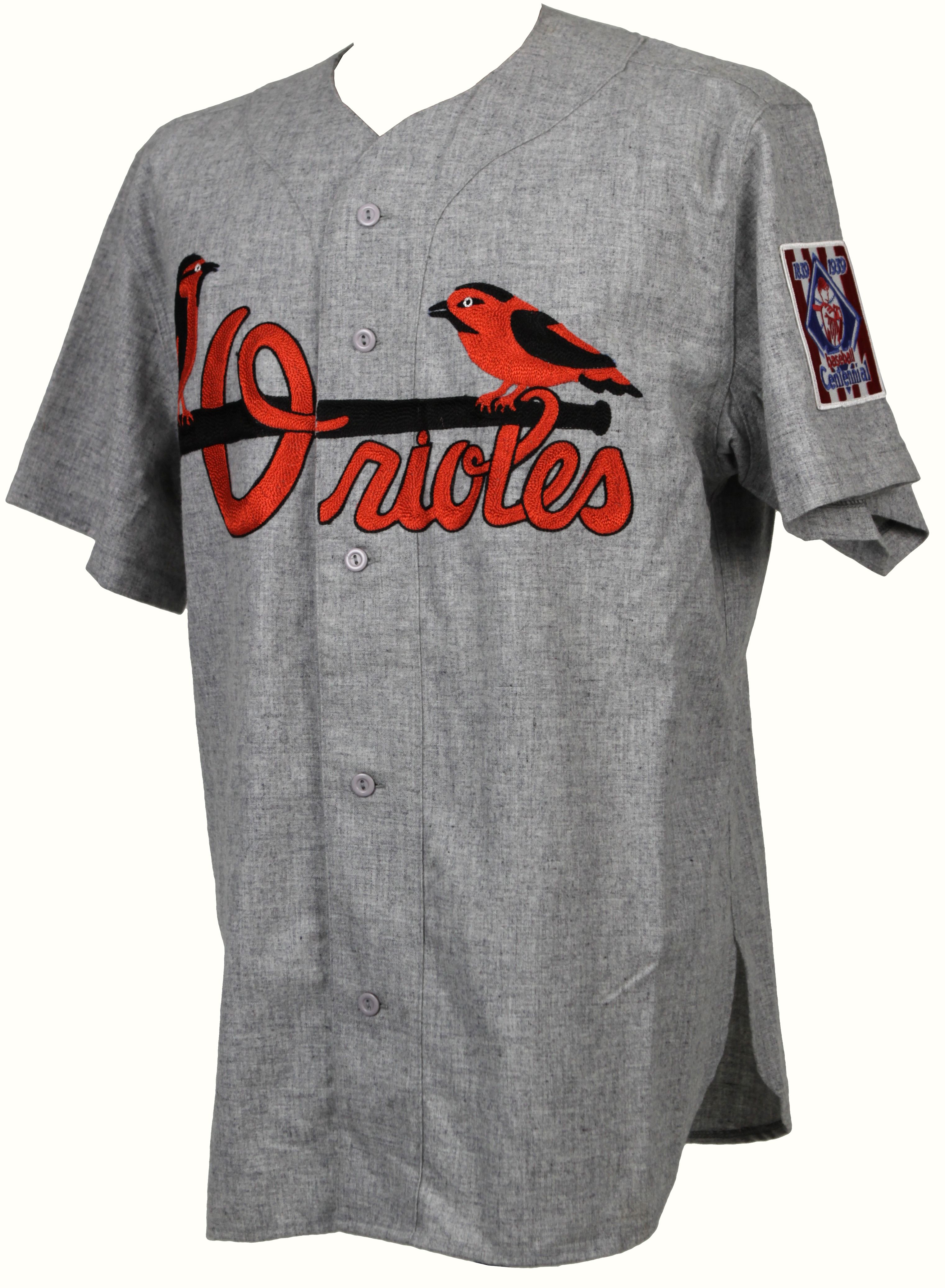
The Orioles' current home caps and helmets, with the white panel in the front, were a big hit here at Uni Watch HQ when they were reintroduced in 2012. But it's time to admit the hard truth: The white panel was really fun in the 1970s but doesn't work so well today. In fact, it feels a bit rinky-dink, like something a minor league team would wear. Still, a decent-looking set (black and orange work so well together), but they should go back to a conventional headwear template.


THANK YOU!


@DJ_McCann

#2 Mike in STL

Mike in STL

    HOF

  • Members
  • PipPipPipPipPip
  • 28,346 posts

Posted 27 February 2015 - 08:47 PM

Disagree. The white panel with the home whites is awesome. And better with the home Orange. Black with the road grays is perfect too. Dont change a thing...except get rid of the "O's" hat.
  • SammyBirdland likes this
@BSLMikeRandall

#3 SBTarheel

SBTarheel

    HOF

  • Members
  • PipPipPipPipPip
  • 14,851 posts
  • LocationEldersburg, Md

Posted 27 February 2015 - 09:31 PM

The Dodgers home should be #1 every year. 


Love those jerseys. 


@beginthebegin71

#4 Mike in STL

Mike in STL

    HOF

  • Members
  • PipPipPipPipPip
  • 28,346 posts

Posted 27 February 2015 - 11:28 PM

The Dodgers home should be #1 every year. 
 
Love those jerseys. 


I would put those #2 and the Cardinals home #1. Only Because the Cardinals are perched on a baseball bat.


@BSLMikeRandall

#5 SBTarheel

SBTarheel

    HOF

  • Members
  • PipPipPipPipPip
  • 14,851 posts
  • LocationEldersburg, Md

Posted 27 February 2015 - 11:38 PM

I would put those #2 and the Cardinals home #1. Only Because the Cardinals are perched on a baseball bat.

Definitely a very cool logo, but I've always liked the Cubs, so it's tough to put the Cards at #1. 


@beginthebegin71

#6 RShack

RShack

    Fair-weather ex-diehard

  • Members
  • PipPipPipPipPip
  • 22,994 posts

Posted 28 February 2015 - 01:49 AM

I would put those #2 and the Cardinals home #1. Only Because the Cardinals are perched on a baseball bat.


The minor league O's jerseys had that too... in the '30's or '40's, I forget exactly when... you used to be able to get a new one from Ebbets Field Flannels, but then MLB Inc clamped down on them making ancient ML uniforms, the jerks... even after they quit selling them, they still had one somewhere on their web site, just because it looked cool (as really old uniforms go...)


EDIT: it was a 1939 jersey: http://www.onlinespo...flannels-3.html


47906a_lg.jpeg...


  • Russ, SammyBirdland and Mike in STL like this

 "The only change is that baseball has turned Paige from a second-class citizen to a second-class immortal." - Satchel Paige


#7 NewMarketSean

NewMarketSean

    HOF

  • Members
  • PipPipPipPipPip
  • 23,694 posts

Posted 28 February 2015 - 08:03 AM

Agreed. Get rid of O's hat, double down white panel and cartoon bird.

Can't believe I lived so much of my life with boring ass O's gear.
  • SammyBirdland likes this
I never had friends later on like the ones I had when I was twelve. Jesus, does anyone?

#8 DJ MC

DJ MC

    HOF

  • Members
  • PipPipPipPipPip
  • 23,680 posts
  • LocationBeautiful Bel Air, MD

Posted 28 February 2015 - 11:44 AM

Agreed. Get rid of O's hat, double down white panel and cartoon bird.

Can't believe I lived so much of my life with boring ass O's gear.


Yet you want to live so much of it with ugly-ass O's gear? ;)


@DJ_McCann

#9 mweb08

mweb08

    HOF

  • Members
  • PipPipPipPipPip
  • 30,388 posts
  • LocationRidgely's Delight

Posted 28 February 2015 - 11:49 AM

Agreed. Get rid of O's hat, double down white panel and cartoon bird.


Can't believe I lived so much of my life with boring ass O's gear.

 
Yet you want to live so much of it with ugly-ass O's gear? ;)

We need a dislike on BSL.

#10 DJ MC

DJ MC

    HOF

  • Members
  • PipPipPipPipPip
  • 23,680 posts
  • LocationBeautiful Bel Air, MD

Posted 28 February 2015 - 12:07 PM

We need a dislike on BSL.


I know I'm in the extreme minority. I don't care :P


@DJ_McCann

#11 RShack

RShack

    Fair-weather ex-diehard

  • Members
  • PipPipPipPipPip
  • 22,994 posts

Posted 28 February 2015 - 04:14 PM

The 1939 cap was pretty fugly... I think the bird looks strange, in large part because of how its legs are splayed apart... I wonder why they did that...


947ca4cf4448574451abad8a38638616.jpg


 "The only change is that baseball has turned Paige from a second-class citizen to a second-class immortal." - Satchel Paige


#12 SammyBirdland

SammyBirdland

    Member

  • Members
  • PipPipPipPipPip
  • 12,019 posts

Posted 28 February 2015 - 09:13 PM

The 1939 cap was pretty fugly... I think the bird looks strange, in large part because of how its legs are splayed apart... I wonder why they did that...


947ca4cf4448574451abad8a38638616.jpg


Unfortunate line placement.


CqaR3B7.jpg


  • You Play to Win the Game and Mike in STL like this
¡Hasta la vista, pelota!


0 user(s) are reading this topic

0 members, 0 guests, 0 anonymous users


Our Sponsors


 width=